ConstraintLayout是Android Studio 2.2中主要的新增功能之一,也是Google在去年的I/O大会上重点宣传的一个功能,升级Android Studio 2.3之后,IDE默认生成的Activity布局都是以ConstraintLayout做为根布局。
新技术毕竟有其优势,google大力宣传的ConstraintLayout有以下两大特性:
- 可视化操作编写界面,提高开发效率
- 有效地解决布局嵌套过多的问题,是一个升级版的RelativeLayout,有效提升性能
下面对其进行一个学习总结,毕竟这个布局是为了可视化而生,可视化操作的练习是必不可少的。由于constraintLayout的拖拽部分涉及到太多的动态效果图,就不详细描述了,已有很多文章写过这部分。其实constraintLayout的很多属性对于我们来说是新鲜的,是其它布局所没有的,所以这里主要总结一下constraintLayout的属性学习。
添加依赖
使用constraintLayout需要添加以下依赖
1
| classpath 'com.android.support.constraint:constraint-layout:XXX'
|
基本用法
app:layout_constraintBottom_toBottomOf=”parent”
当前控件底部的布局约束是位于parent控件底部,parent是指包裹着它的ConstraintLayout,也可以设置指定某个控件的id。效果类似于RelativeLayout的layout_alignParentBottom=”true”
对比RelativeLayout,同类的属性还有以下这些
app:layout_constraintLeft_toLeftOf = layout_alignParentLeft=”true”
app:layout_constraintBottom_toBottomOf = layout_alignParentBottom=”true”
app:layout_constraintRight_toRightOf = layout_alignParentRight=”true”
app:layout_constraintTop_toTopOf = layout_alignParentTop=”true”
app:layout_constraintLeft_toRightOf = toRightOf
app:layout_constraintRight_toLeftOf = toLeftOf
app:layout_constraintTop_toBottomOf = toBottomOf
app:layout_constraintBottom_toTopOf = toTopOf
app:layout_constraintBaseline_toBaselineOf 此控件与指定控件水平对齐
点击该button按钮,下方会出现 x,ab两个图标,x表示去掉所有约束,ab表示切换显示横条还是四个点,点击ab,button中间会出现一根横条,然后把该控件和指定控件的横条相连就行了。
goneMargin属性
这些设置生效于当依赖的约束对象被设置visibility为gone时,支持的属性如下:
layout_goneMarginStart
layout_goneMarginEnd
layout_goneMarginLeft
layout_goneMarginTop
layout_goneMarginRight
layout_goneMarginBottom
比如A,B两个view,B在A的右边,这时候如果A消失了,但是你想让B在父布局的右边多少距离,就可以使用这个属性。
Bias属性
ConstraintLayout新增了如下两个属性用于控制控件在水平和垂直方向在屏幕上的偏移比例
当目标控件设置好水平方向约束
app:layout_constraintLeft_toLeftOf=”parent”、app:layout_constraintRight_toRightOf=”parent”
或者垂直方向约束时
app:layout_constraintTop_toTopOf=”parent”、app:layout_constraintBottom_toBottomOf=”parent”
layout_constraintHorizontal_bias和layout_constraintVertical_bias会随着控件的拖到一直发生相应的变化,如果你需要居中,那么直接将这两个属性的参数值设置为0.5即可。
与其他Layout不同之处
它的layout_width和layout_height不支持设置match_parent,其属性取值只有以下三种情况:
wrap_content;
指定具体dp值;
0dp(match_constraint),代表填充约束之意。和match_parent不一样
要让一个控件的宽高按某个比例进行布局可以使用layout_constraintDimentionRatio属性设置宽高比例,前提是目标控件的layout_width和layout_height至少有一个设置为0dp,为0dp那个按宽高比适应
layout_constraintDimentionRatio默认参数比例是指宽:高
使其高:宽写成app:layout_constraintDimensionRatio=”H,2:1”。
链条(Chains)
实现LinearLayout的水平布局
app:layout_constraintHorizontal_chainStyle
水平方向的layout_constraintHorizontal_chainStyle
垂直方向的layout_constraintVertical_chainStyle
两者均有spread,spread_inside,packed这三种取值
1
2
3
4
5
6
7
8
9
10
11
12
13
14
15
16
17
18
19
20
21
22
23
24
25
26
27
28
29
| <?xml version="1.0" encoding="utf-8"?>
<android.support.constraint.ConstraintLayout xmlns:android="http://schemas.android.com/apk/res/android"
xmlns:app="http://schemas.android.com/apk/res-auto"
android:layout_width="match_parent"
android:layout_height="match_parent">
<Button
android:id="@+id/btn1"
android:layout_width="wrap_content"
android:layout_height="wrap_content"
app:layout_constraintHorizontal_chainStyle="spread"
app:layout_constraintLeft_toLeftOf="parent"
app:layout_constraintRight_toLeftOf="@+id/btn2" />
<Button
android:id="@+id/btn2"
android:layout_width="wrap_content"
android:layout_height="wrap_content"
app:layout_constraintLeft_toRightOf="@+id/btn1"
app:layout_constraintRight_toLeftOf="@+id/btn3" />
<Button
android:id="@+id/btn3"
android:layout_width="wrap_content"
android:layout_height="wrap_content"
app:layout_constraintLeft_toRightOf="@+id/btn2"
app:layout_constraintRight_toRightOf="parent" />
</android.support.constraint.ConstraintLayout>
|
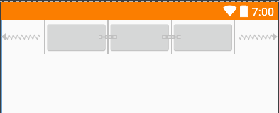
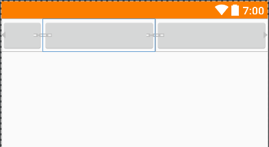
效果图如下
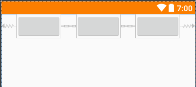
当app:layout_constraintHorizontal_chainStyle = “spread_inside”
效果图如下
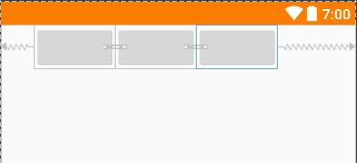
当app:layout_constraintHorizontal_chainStyle = “packed”
效果图如下
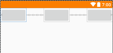
bias链条
当app:layout_constraintHorizontal_chainStyle = “packed”的情况下,通过设置head头控件的bias属性,来设置链条的位置(更偏向左或更偏向右)
1
2
3
4
5
6
7
8
9
10
11
12
13
14
15
16
17
18
19
20
21
22
| <Button
android:id="@+id/btn1"
android:layout_width="wrap_content"
android:layout_height="wrap_content"
app:layout_constraintHorizontal_bias="0.3" // 权重为靠左0.3
app:layout_constraintHorizontal_chainStyle="packed" // 样式为packed
app:layout_constraintLeft_toLeftOf="parent"
app:layout_constraintRight_toLeftOf="@+id/btn2" />
<Button
android:id="@+id/btn2"
android:layout_width="wrap_content"
android:layout_height="wrap_content"
app:layout_constraintLeft_toRightOf="@+id/btn1"
app:layout_constraintRight_toLeftOf="@+id/btn3" />
<Button
android:id="@+id/btn3"
android:layout_width="wrap_content"
android:layout_height="wrap_content"
app:layout_constraintLeft_toRightOf="@+id/btn2"
app:layout_constraintRight_toRightOf="parent" />
|
效果图如下
权重链
如果将控件的layout_width和layout_height设置成为0dp,还可以配合layout_constraintHorizontal_weight、layout_constraintVertical_weight两个属性实现和LinearLayout中设置layout_weight相同的效果
1
2
3
4
5
6
7
8
9
10
11
12
13
14
15
16
17
18
19
20
21
22
23
24
25
26
27
28
29
30
| <?xml version="1.0" encoding="utf-8"?>
<android.support.constraint.ConstraintLayout xmlns:android="http://schemas.android.com/apk/res/android"
xmlns:app="http://schemas.android.com/apk/res-auto"
android:layout_width="match_parent"
android:layout_height="match_parent">
<Button
android:id="@+id/btn1"
android:layout_width="60dp"
android:layout_height="wrap_content"
app:layout_constraintLeft_toLeftOf="parent"
app:layout_constraintRight_toLeftOf="@+id/btn2" />
<Button
android:id="@+id/btn2"
android:layout_width="0dp"
android:layout_height="wrap_content"
app:layout_constraintHorizontal_weight="1"
app:layout_constraintLeft_toRightOf="@+id/btn1"
app:layout_constraintRight_toLeftOf="@+id/btn3" />
<Button
android:id="@+id/btn3"
android:layout_width="0dp"
app:layout_constraintHorizontal_weight="1"
android:layout_height="wrap_content"
app:layout_constraintLeft_toRightOf="@+id/btn2"
app:layout_constraintRight_toRightOf="parent"/>
</android.support.constraint.ConstraintLayout>
|
当layout_width设置为60dp时,app:layout_constraintHorizontal_weight="1"平分剩余的空间,效果图如下
GuildLine
这是一个辅助我们布局的View,并且默认设置了visibility为gone
Guideline也分为垂直和水平两种
设置在屏幕中所处的位置
layout_constraintGuide_begin 引导线距离左边框的距离
layout_constraintGuide_end 中引导线距离右边框的距离
layout_constraintGuide_percent 在整个布局中引导线距离左边框的百分比
(app:layout_constraintGuide_percent=”0.5”表示距离左边框50%的位置)
2018.5.15 更新内容:
圆形布局
一个控件以另一个控件的中心为基准,以一定的角度和距离进行定位,如buttonB在buttonA的
顺时针方向45度,半径为100dp的位置
1
2
3
4
5
| <Button android:id="@+id/buttonA" ... />
<Button android:id="@+id/buttonB" ...
app:layout_constraintCircle="@+id/buttonA"
app:layout_constraintCircleRadius="100dp"
app:layout_constraintCircleAngle="45" />
|
layout_constraintCircle参照的控件id
layout_constraintCircleRadius圆半径
layout_constraintCircleAngle偏离角度,当水平右方向为0时,逆时针方向旋转
屏障布局
将多个带约束的组件看作一个整体,以此为基准,约束其它的组件,如常见的表单填写,左边是textview的标签,右边是edittext的输入框这种常见布局,一般都是以左边textview最长的控件为准,确定右边的edittext的位置
1
2
3
4
5
6
7
8
9
10
11
12
13
14
15
16
17
18
19
20
21
22
23
24
25
26
27
28
29
30
31
32
33
34
35
36
37
38
39
40
41
| <TextView
android:id="@+id/tv_id"
android:layout_width="wrap_content"
android:layout_height="wrap_content"
android:text="帐号:"
app:layout_constraintBottom_toBottomOf="@+id/et_id"
app:layout_constraintTop_toTopOf="@+id/et_id"/>
<TextView
android:id="@+id/tv_password"
android:layout_width="wrap_content"
android:layout_height="wrap_content"
android:layout_marginTop="8dp"
android:text="联系方式:"
app:layout_constraintBottom_toBottomOf="@+id/et_password"
app:layout_constraintTop_toTopOf="@+id/et_password"/>
<EditText
android:id="@+id/et_id"
android:layout_width="0dp"
android:layout_height="wrap_content"
android:hint="请输入姓名"
app:layout_constraintLeft_toLeftOf="@+id/barrier"
app:layout_constraintRight_toRightOf="parent"
app:layout_constraintTop_toTopOf="parent"/>
<EditText
android:id="@+id/et_password"
android:layout_width="0dp"
android:layout_height="wrap_content"
android:hint="请输入联系方式"
app:layout_constraintLeft_toLeftOf="@+id/barrier"
app:layout_constraintRight_toRightOf="parent"
app:layout_constraintTop_toBottomOf="@+id/et_id"/>
<android.support.constraint.Barrier
android:id="@+id/barrier"
android:layout_width="wrap_content"
android:layout_height="wrap_content"
app:barrierDirection="right"
app:constraint_referenced_ids="tv_id,tv_password"/>
|
barrierDirection 以这多个组件为基准,设置屏障的位置
constraint_referenced_ids 多个基准组件的id
强制约束
当控件的宽度设置为WRAP_CONTENT时,如果实际宽度超过了约束的宽度,约束会失效,这个实际宽度可能会受到内容的影响,比如button中的文字太长时,会让以前的约束失效。
防止约束失效,需要设置以下属性:
水平方向上仍然约束: layout_constrainedWidth="true|false" //默认false
垂直方向上仍然约束: layout_constrainedHeight="true|false" //默认false
到此约束布局的基本用法总结就结束了,接下来就需要更多的时间进行可视化操作练习~